Branding and website for Plastik, an academic journal
Title: UX Lead and Project Manager
Location: Paris, France
Dates: 2017
http://plastik.univ-paris1.fr
I managed a team of seven peers over a period of eight months to produce an end-to-end website and visual identity for an academic journal. Plastik explores the bridge between art and science, presenting writings on how artists respond to, utilize, and inform the sciences. Our graphic designers produced a well-researched visual identity based on the periodic table, with an emphasis on the images featured in most of the articles. Our UX team created a three-column interface that was reminiscent of the journal’s original paper design, with unique technical elements for the images and footnotes. Our developers then built a custom WordPress theme with a solid back-end and an anchor system for the images and footnotes.
Concept Ideation
In the exploration process, as product manager I emphasized the ideation process and focused my designers and developers on a holistic approach to the product design and implementation. We worked together from beginning to end and I was able to cultivate design ideas from my developers and technical ideas from my designers. We started out by exploring the theoretical bridges and divides between the arts and sciences, in order to formulate a visual response to the mission of the journal.
![]() Brainstorming exercise stemming from the journal’s key concepts: Scientific research and contemporary art.
Brainstorming exercise stemming from the journal’s key concepts: Scientific research and contemporary art.
 Brainstorming exercise stemming from the journal’s key concepts: Scientific research and contemporary art.
Thematic Orientations
Based on our user research and visual benchmarking, we presented the client with three “orientations” to choose from before starting the production process. We surveyed a selection of professors and students to determine the most coherent branding and user-friendly interface for the online journal. The three orientations were based on scientific theories:
![]() a) Fibonnaci numbers
a) Fibonnaci numbers
![]() b) Linear & columnal frameworks
b) Linear & columnal frameworks
![]() c) The periodic table
c) The periodic table
We presented each one to our client and they ended up choosing the periodic table orientation. However, we incorporated elements of each of the others into the final design: the full-screen layout for the lecture page from (a) and the linear anchor system for the articles from (b).
 a) Fibonnaci numbers
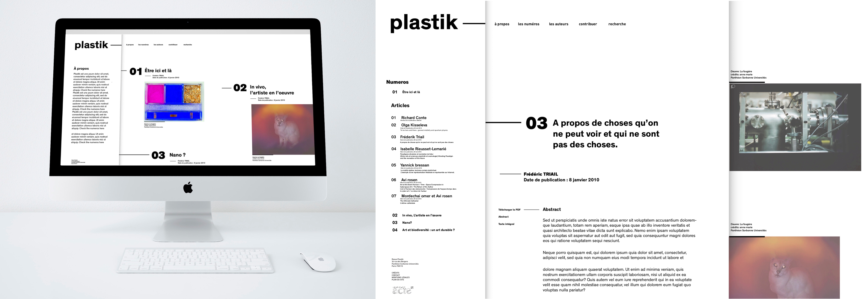 b) Linear & columnal frameworks
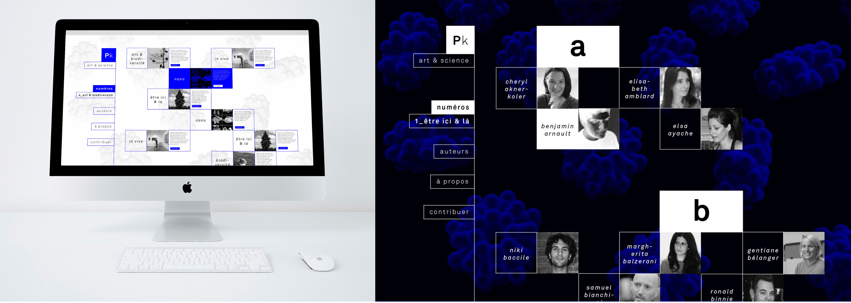 c) The periodic table
We presented each one to our client and they ended up choosing the periodic table orientation. However, we incorporated elements of each of the others into the final design: the full-screen layout for the lecture page from (a) and the linear anchor system for the articles from (b).
Sitemap
We then dug deeper into our user research, creating use cases and personas to inform the necessary pages. Once the sitemap was created we then continued prototyping, testing, and producing refined iterations of each page.
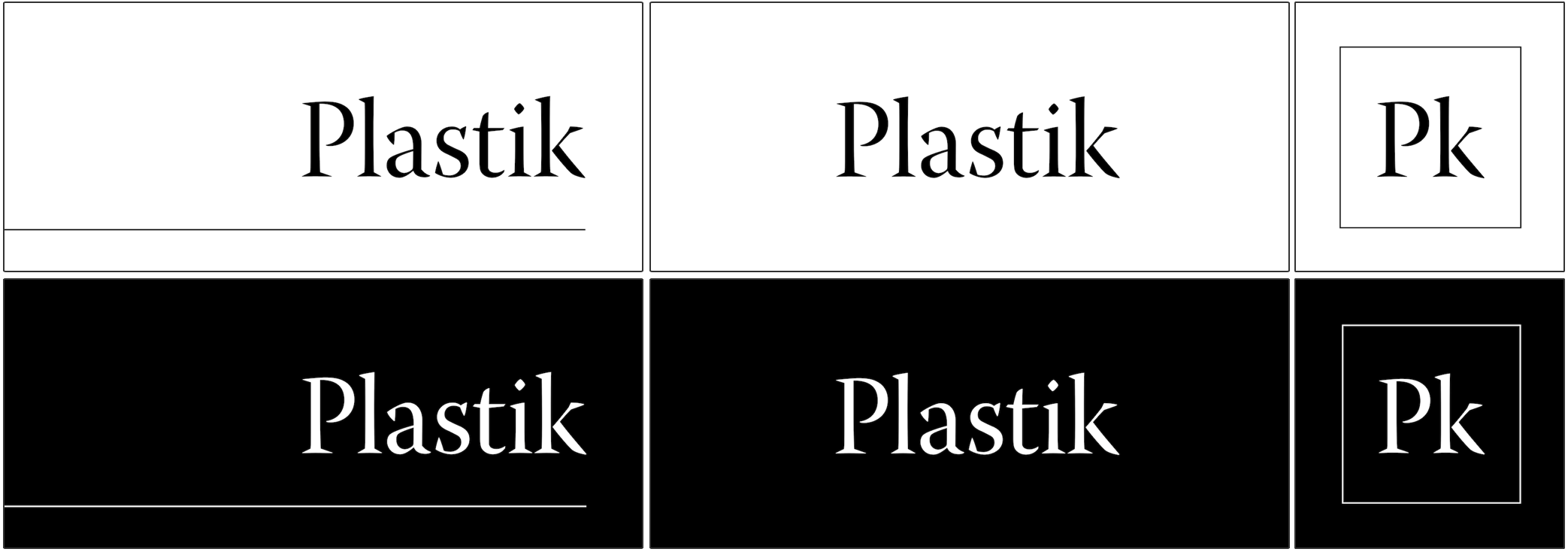
Brand Identity and Style Guide
The graphic identity is loosely based on the periodic table but the logo is kept very simple to allow for the valorization of the photographic image throughout the review. In keeping with the periodic table theme, we utilized an abbreviation pattern for the logo and the site menu.
![]() Logotype
Logotype
![]() Style guide
Style guide
The font, Adobe Warnock Pro, which was chosen for use on both web and print, retains an element of sophistication and traditional academic journal but has unique touches like the pronounced shapes in the serifs, for more character.
 Logotype
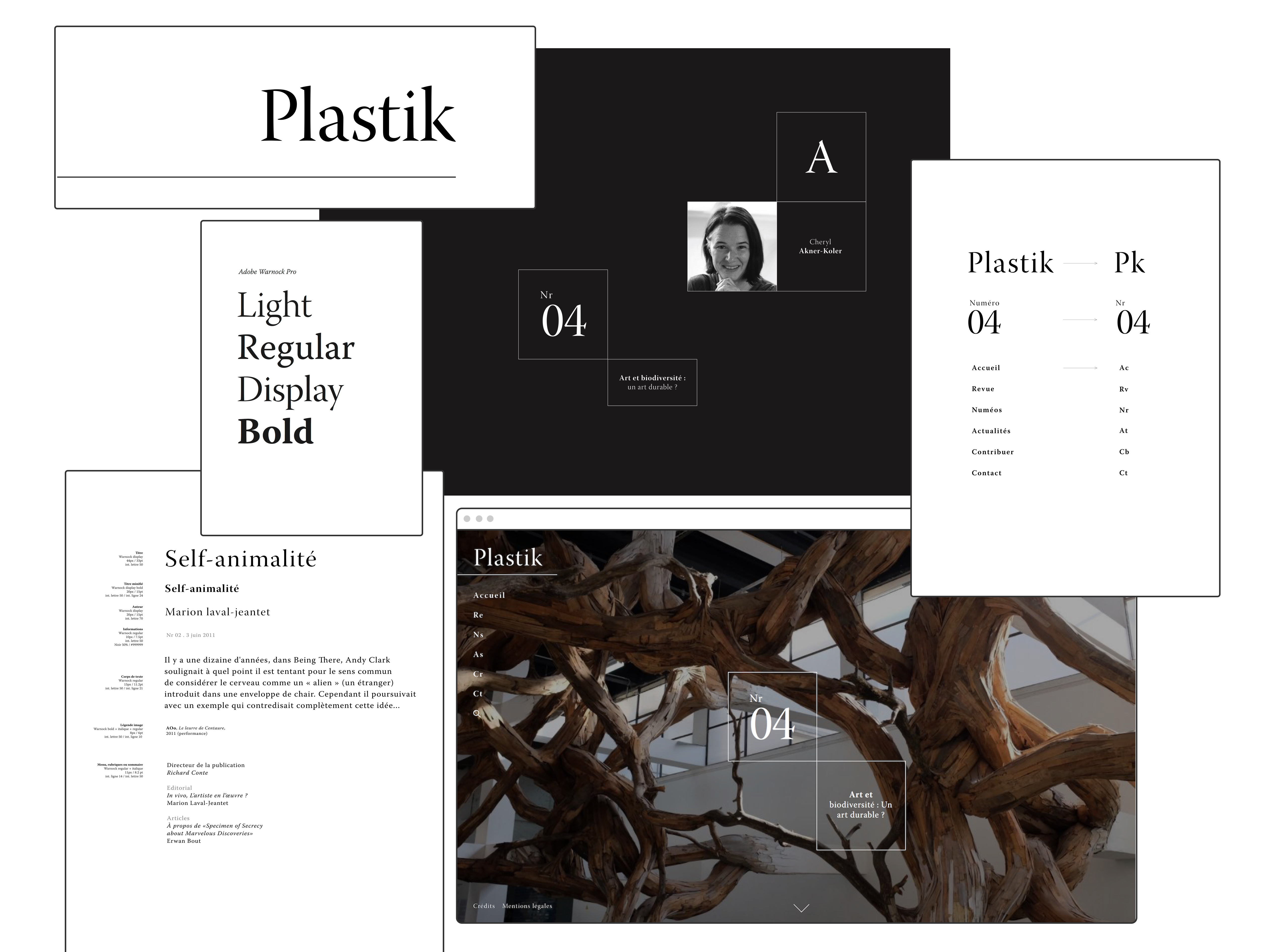 Style guide
The font, Adobe Warnock Pro, which was chosen for use on both web and print, retains an element of sophistication and traditional academic journal but has unique touches like the pronounced shapes in the serifs, for more character.
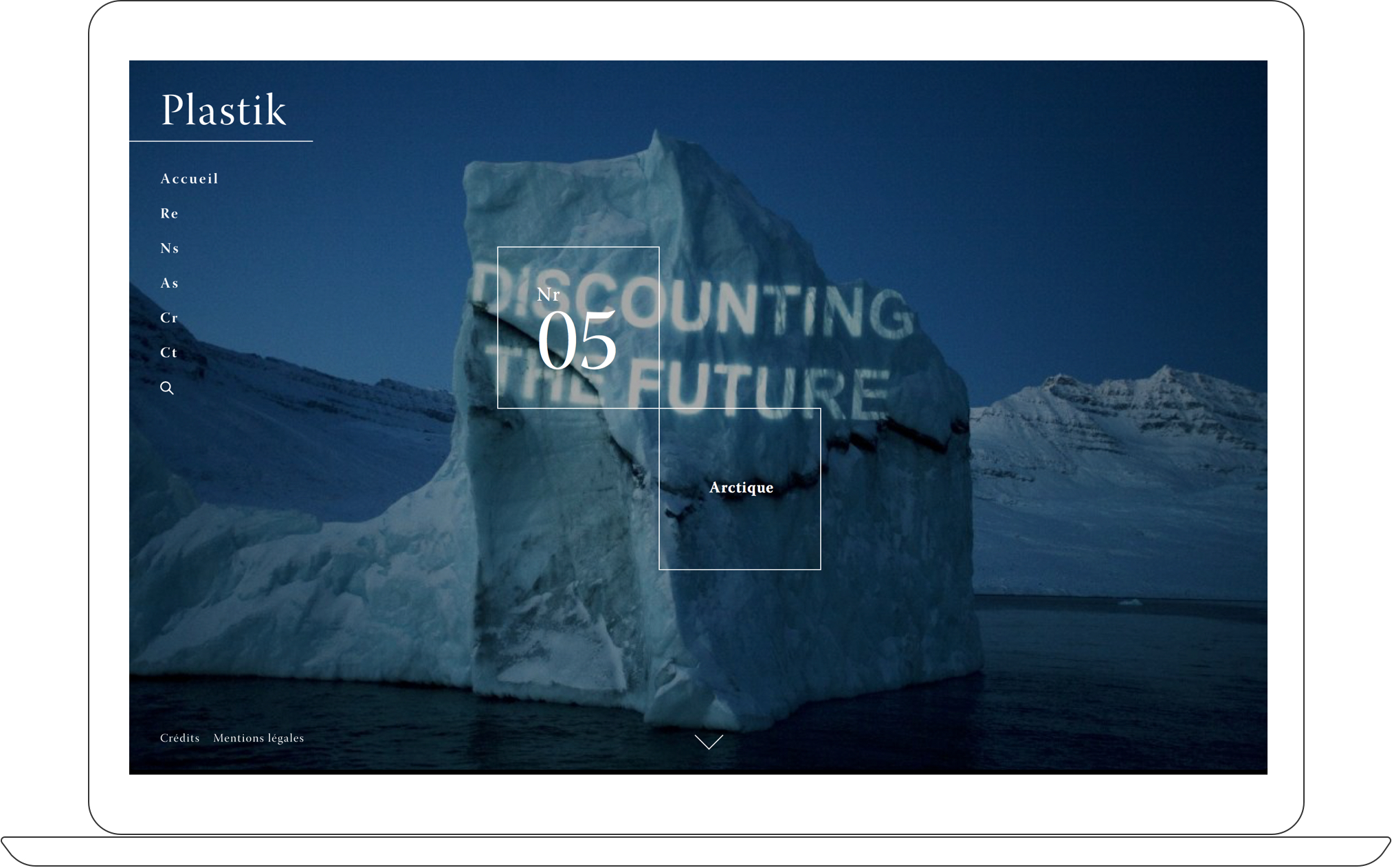
Building the interface: Home screen
To retain the feeling of a print magazine on the online version of the journal, we valorized the image with a full-bleed front page for each issue. Clicking into the issue the user is able to scroll through the table of contents and each individual article within it.
![]() Home page presenting each issue and its cover image one at a time
Home page presenting each issue and its cover image one at a time
 Home page presenting each issue and its cover image one at a time
Building the interface: Article experience
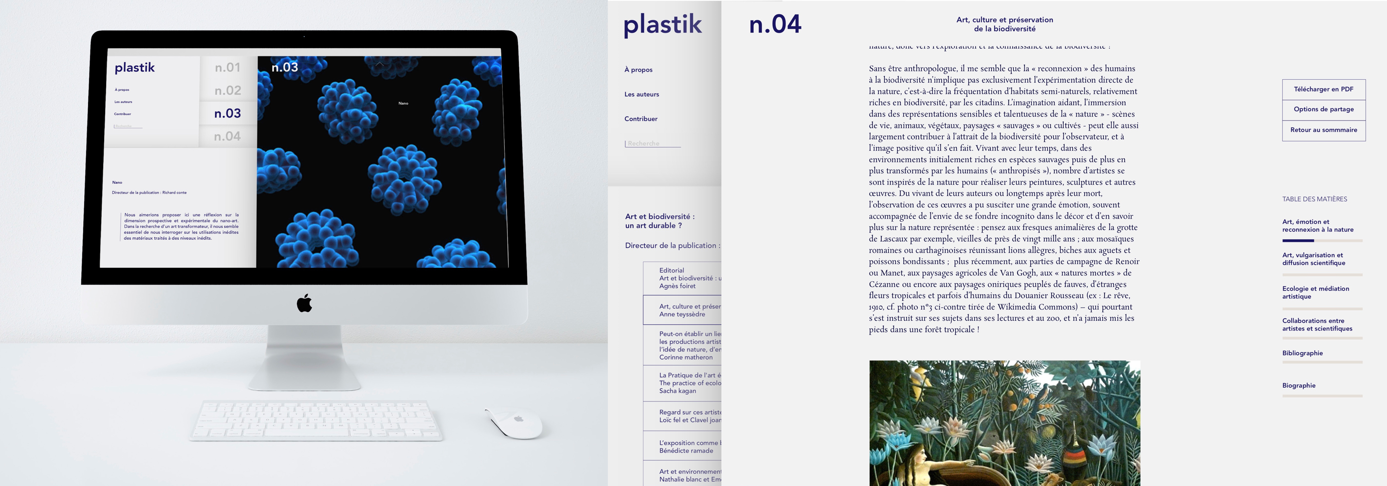
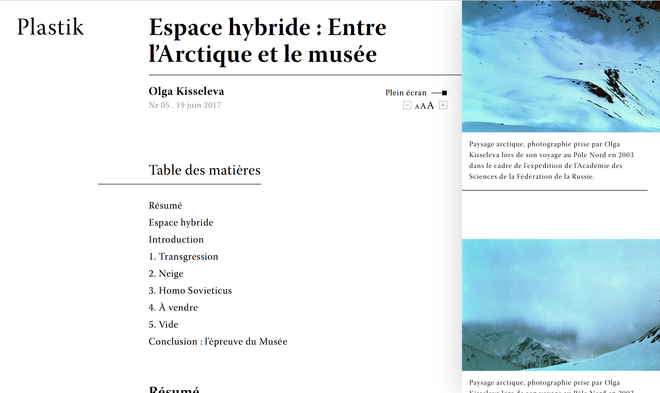
We created a dual-scrolling behavior where as the user progresses through the article, corresponding images would auto-scroll on the right side section, based on meta tags within the text. Additionally, the footnotes of each article were clickable within the article and the user could read them within the side section without losing their place in the main text.
![]() Article view in full screen mode
Article view in full screen mode
![]() Images automatically scrolled based on user position in text
Images automatically scrolled based on user position in text
 Article view in full screen mode
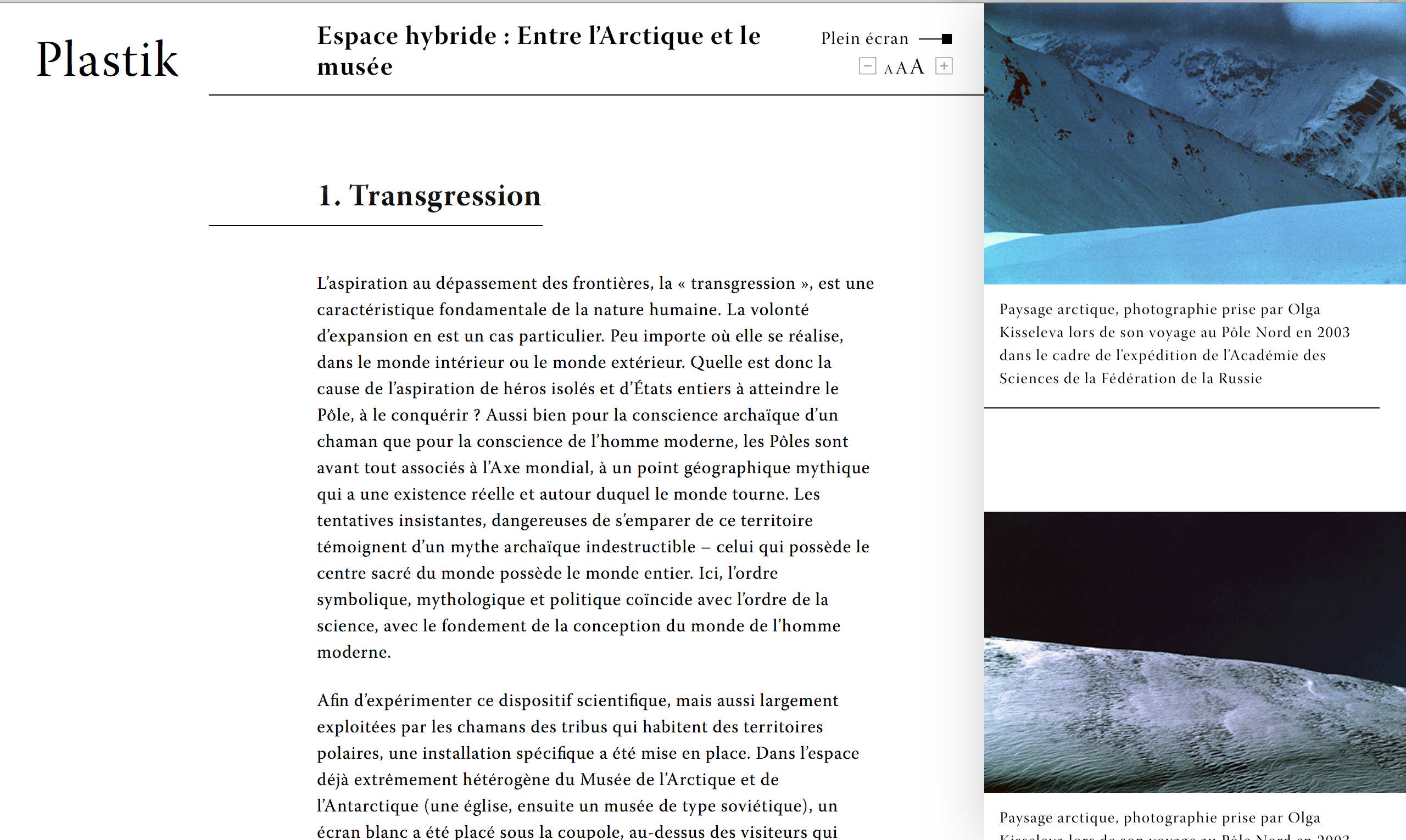 Images automatically scrolled based on user position in text
Building the interface: Additional pages
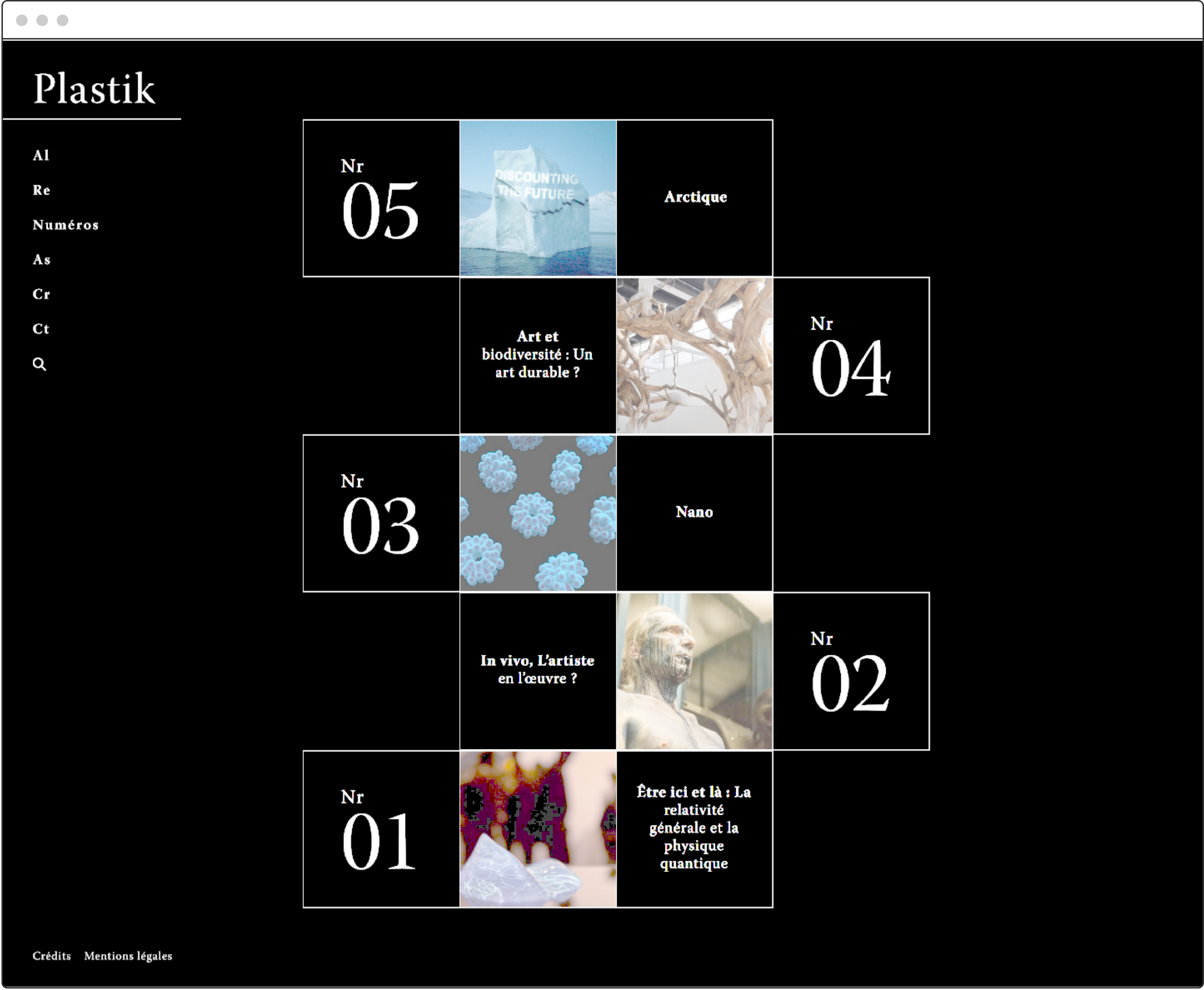
Our client requested that we have a more compact view of the list of all issues, as well as a list of all contributing authors with links to their biographies.
For these pages we continued on the periodic table theme, using a square grid to communicate sections.
![]() Issues page
Issues page
![]()
Contributing authors page
For these pages we continued on the periodic table theme, using a square grid to communicate sections.
 Issues page
Contributing authors page
Case Studies
Winter 2021 - Present
Emissary Design System
Fall 2020 - Spring 2021
Ford Commercial Solutions Design System
Summer - Fall 2020
Ford Telematics Navigation Refresh
Spring 2021
Notifications in Ford Telematics
2017